Semilla De Aurora
Your website is a window to your business. keep it sweet, and allow others to look inside.
Creating a responsive website for a professional website.
Research shows that people who are more connected with nature are usually happier in life and more likely to report feeling their lives are worthwhile. Nature can generate many positive emotions, such as calmness, joy, and creativity and can facilitate concentration.
Project Type: desktop website
My Role: UX, UI
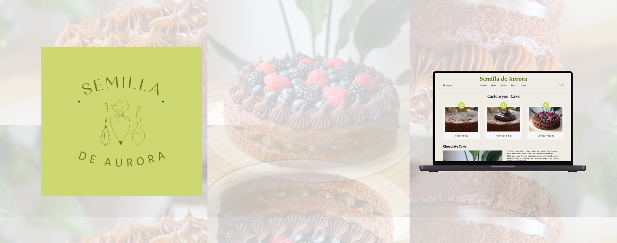
Some overall final designs.


Challenge & Deliverables
Strengthen our existing design process, collaborate with our stakeholder and team to create a new desktop website that will include and end-to-end process and a branding strategy for the client.
Our challenge for this project was to design a new website for our clients Semilla De Aurora a local bakery in Barcelona Spain. Upon meeting our stakeholder, we find that she makes sweet confections that are Brazilian infused cakes to bring her hometown to Europe. My sweet tooth ached in throughout this project.
Integrate UI Principals
Elevate proficiency in Figma
Create a branding strategy

Empathize
In our interview with our stakeholder, we got a full understanding of the business, its goals, and why our clients needs a website. We did some initial research on the city, the area, and what her projective plan is her her and her business.

Empathize
We also dove deep into looking at main competitors in the area. We spent significant time and reasearch look at the top competitors and bakery’s. We did an analysis ring the to four bakeries in the area. What we found most compelling was this similarity and her closest competitor. Take a look at our findings within the branding.

Problem Statement

Define
Here are the personas and journey map we conducted for both the user and our stakeholder. The findings are of interest which helped us conduct our problem statement.


Ideation
We started with skteches, UI principles to narrow down the scope of our project before moving to our low-fi. Here are some of the key pages we created. Since our focus was online ordering. We want to make sure that there was a clear path and flow to her regular items as well as her custom orders.

Site Map
We wanted to ensure that the order process was smooth and not stressful. Keeping in align with common order systems. We didn’t want to go against the grain and make it user friendly.

Mid-fidelity
After some user testing some aspects of our design didn’t seem to align and we made some adjusments. User testing is one of my favorite parts of the ideation process. You really get an outside perspective that makes you see what you can over look. For example our three step diagram was confusing so we adjusted it to make it more clear.

Building The Brand
As you saw from the competitor analysis, she currently had a very similar branding to her competitor. We want to create a mood board that better reflected her business. We went in a different direction that what she had. sweet, like her cakes.

Key Learnings

As a whole
This project was just like the attributes: Smooth, vibrant, friendly, and fun. It was a great experience to work with a stake holder for the first time as a UI UX designer. I felt more confident in my skills and found myself and what I want to do within the project. I had smart and talented women as my team and was so thankful to work with them.
For a deeper scope on this sweet project, please take a look at my case study. If you would like to see the final design, please take a look at the prototype.
